Project Overview
In this project, we aim to transform the way users engage with sports, malls, and venues by embedding a user-friendly mobile wallet within their applications. This integration will enable users to make swift and secure transactions, including purchases of food, drinks, and merchandise, right from their smartphones. Our goals are as follows:
My Role
Actively participated in research activities to understand user needs, pain points, and behaviors, contributing valuable insights to inform the design process.
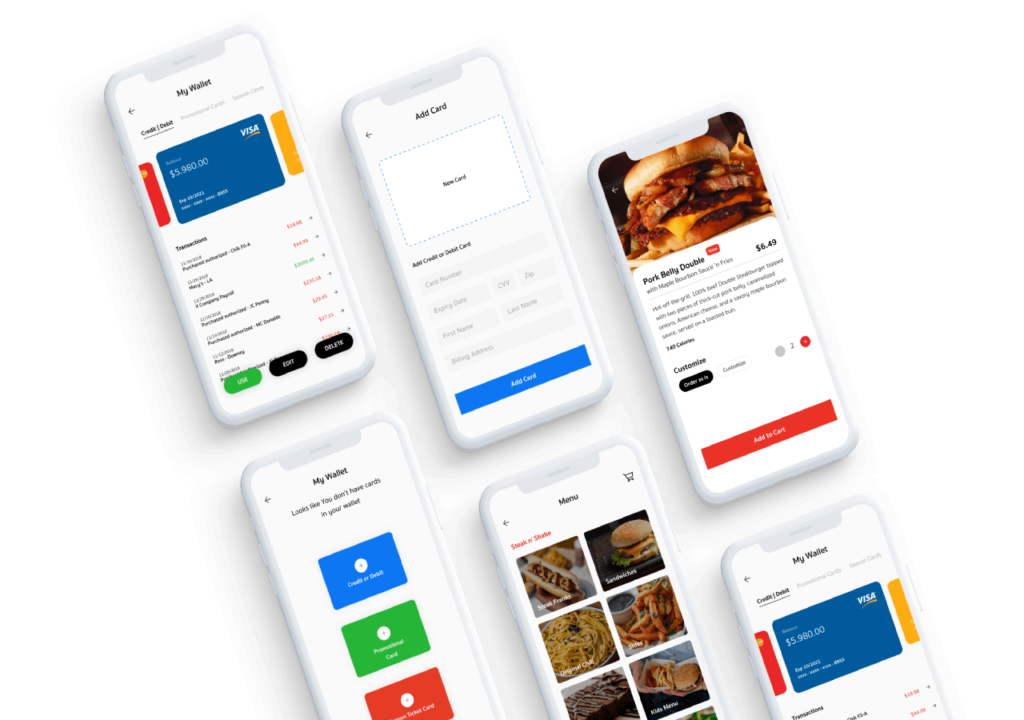
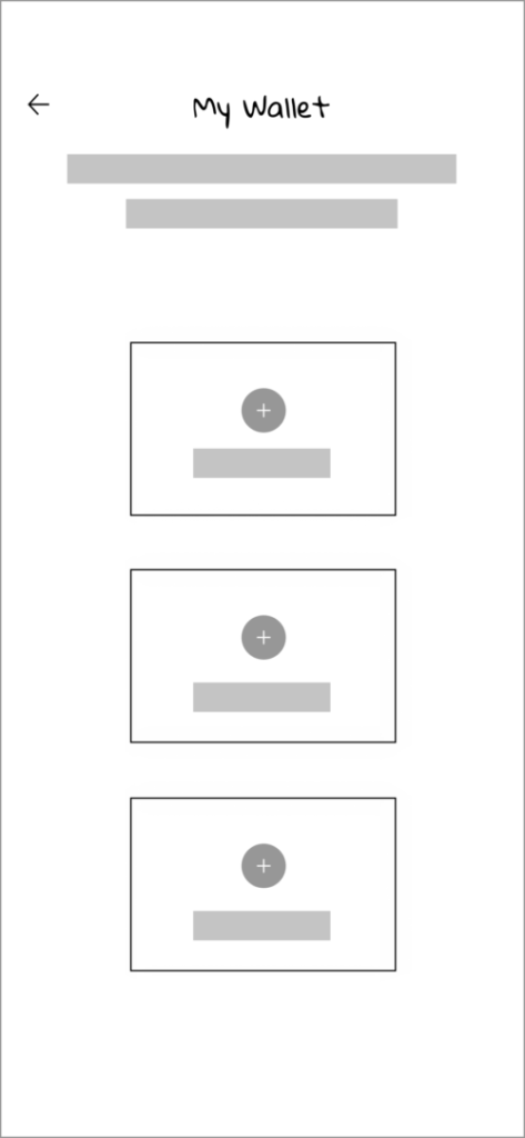
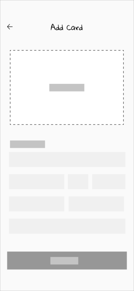
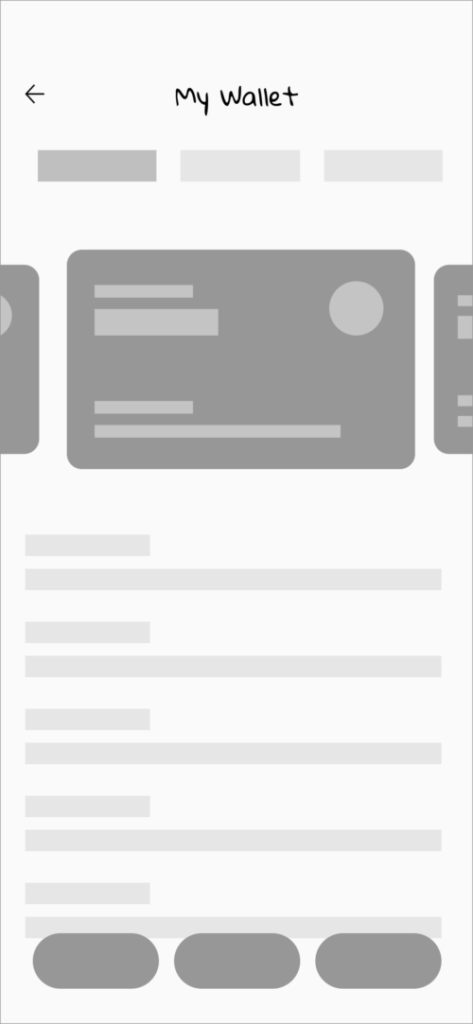
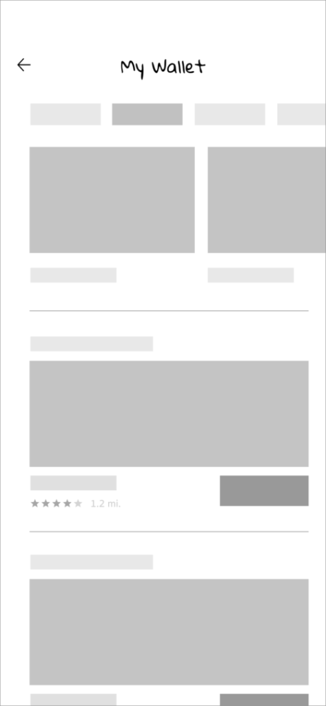
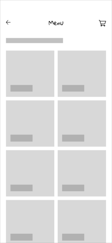
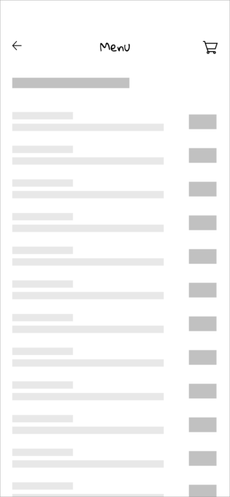
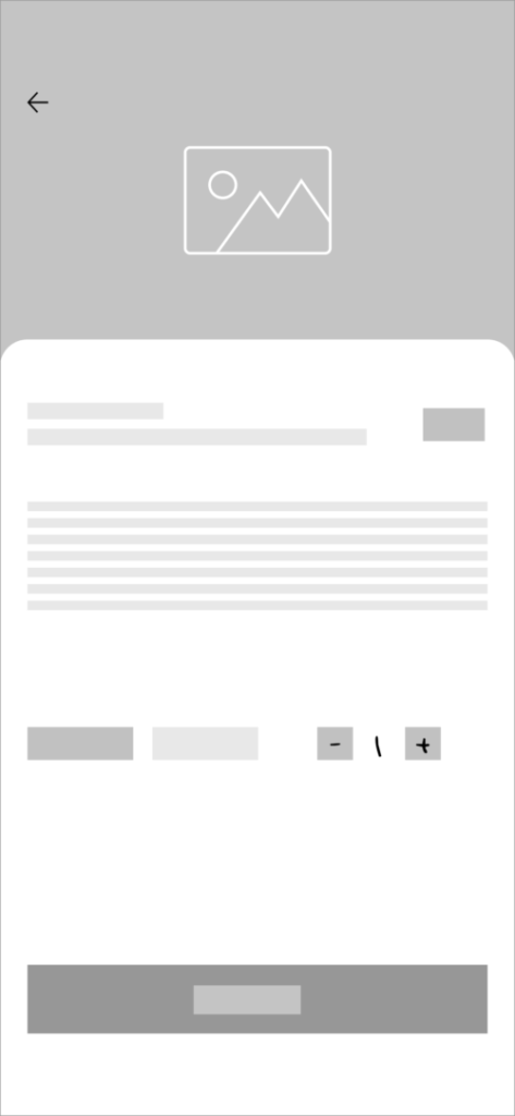
Developed detailed wireframes that visually represented the mobile wallet’s user interface, ensuring a clear and intuitive user experience based on research findings.
Designed interactive prototypes to simulate user interactions and test usability, allowing for iterative improvements and alignment with project goals.
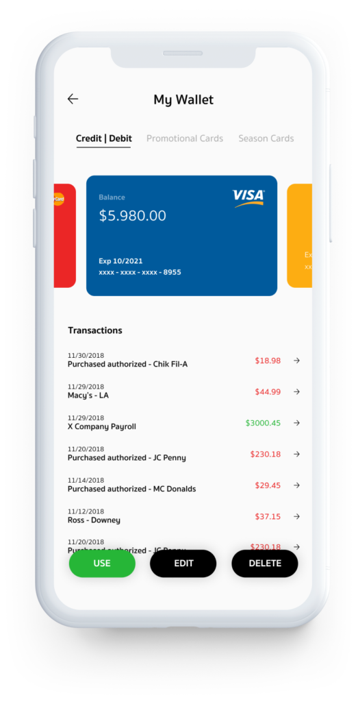
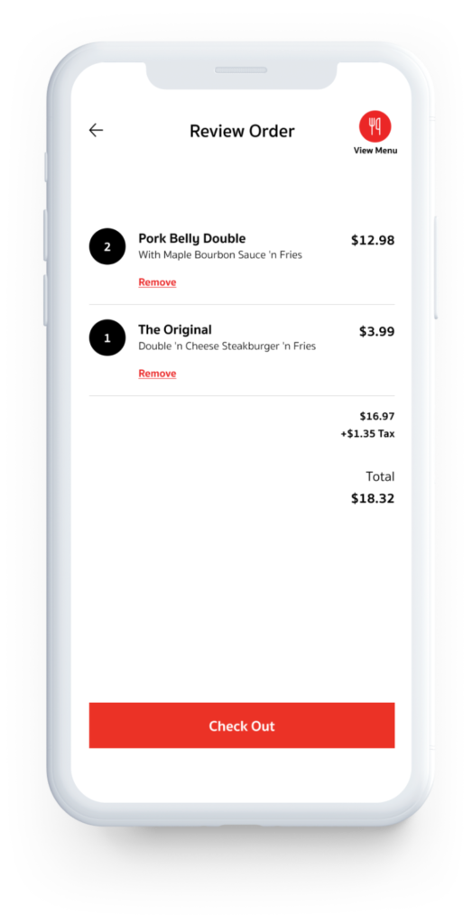
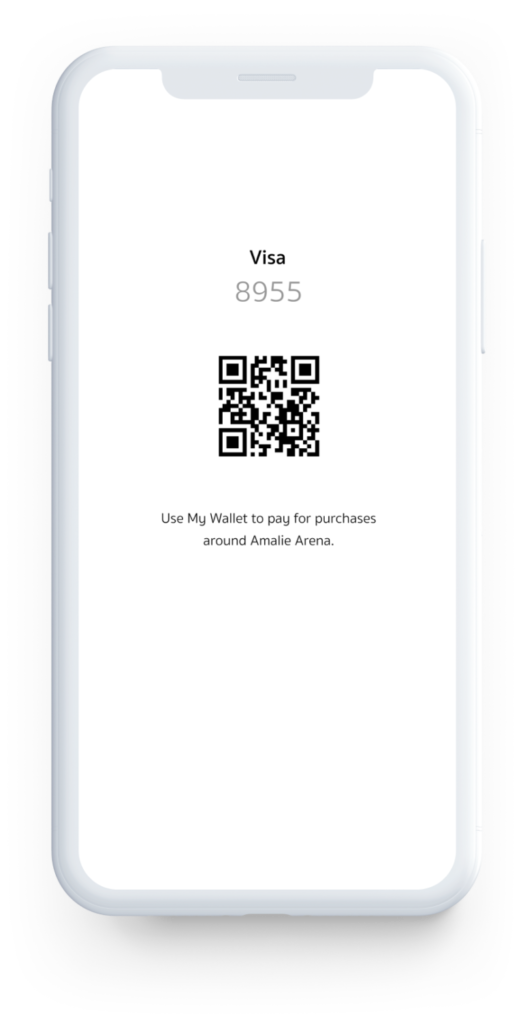
Translated wireframes and prototypes into polished and visually appealing UI screens, ensuring consistency in design elements and adherence to brand guidelines.
Engaged in iterative design processes, incorporating feedback from stakeholders, usability testing, and user feedback to continuously improve the mobile wallet’s user experience.
Target Audience

Research
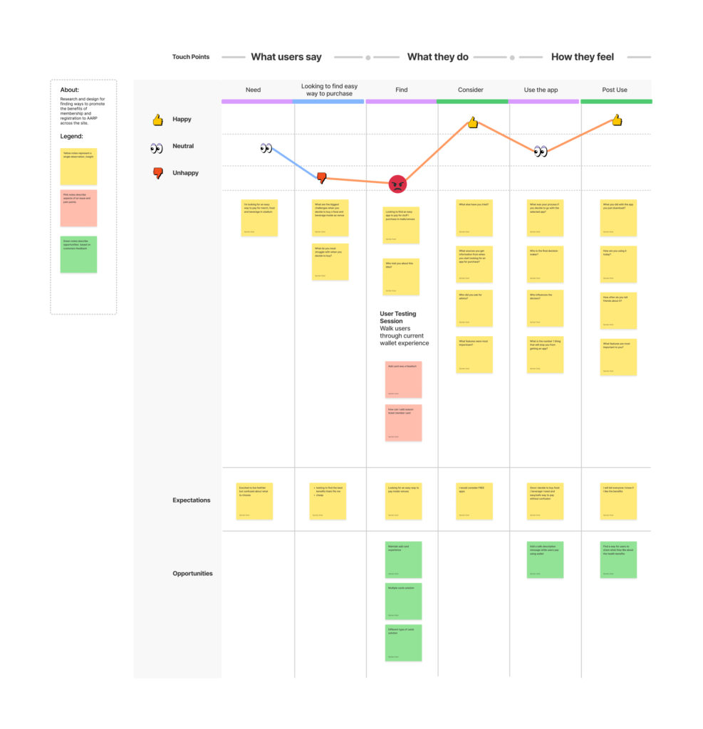
Understand User’s Context and Needs
Competitive Analysis
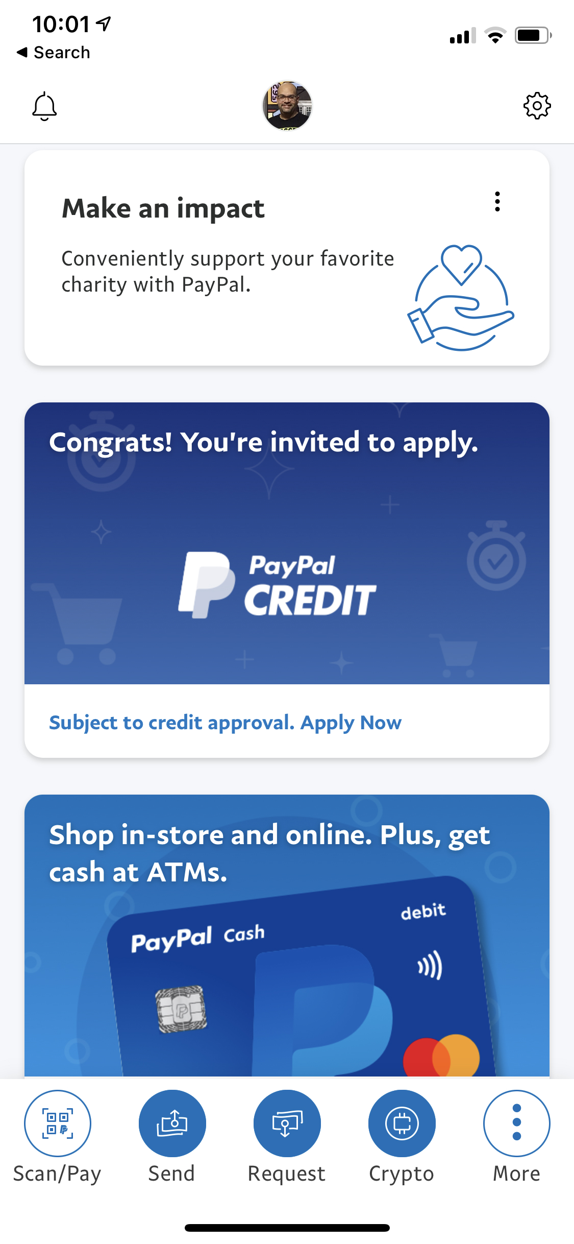
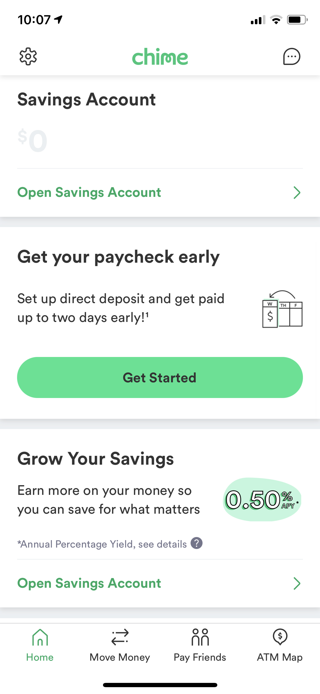
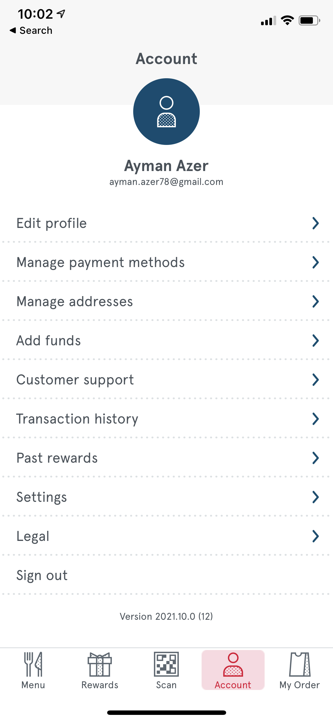
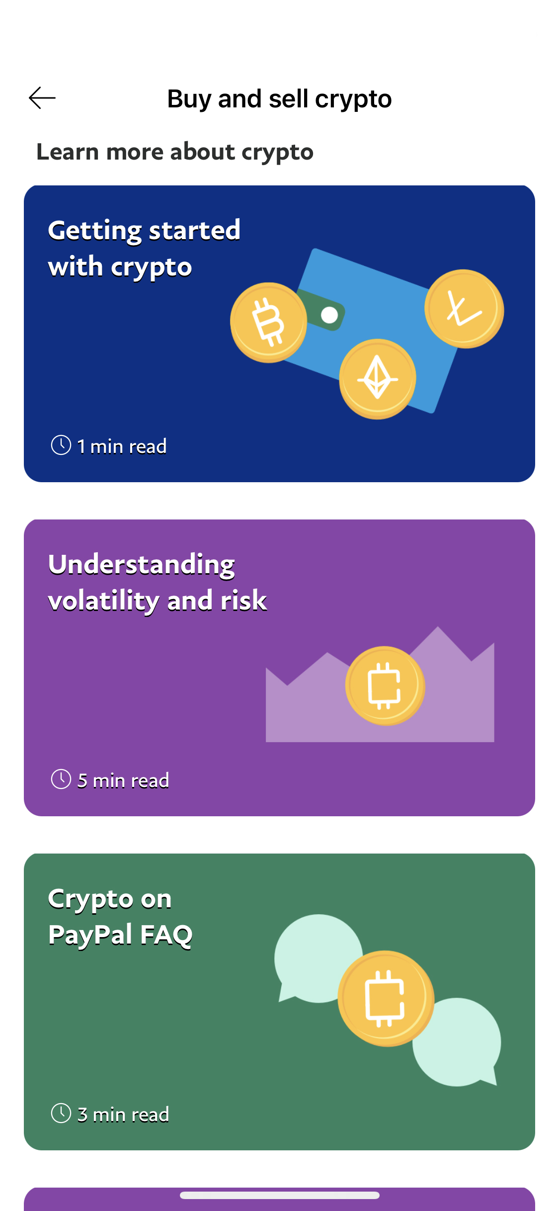
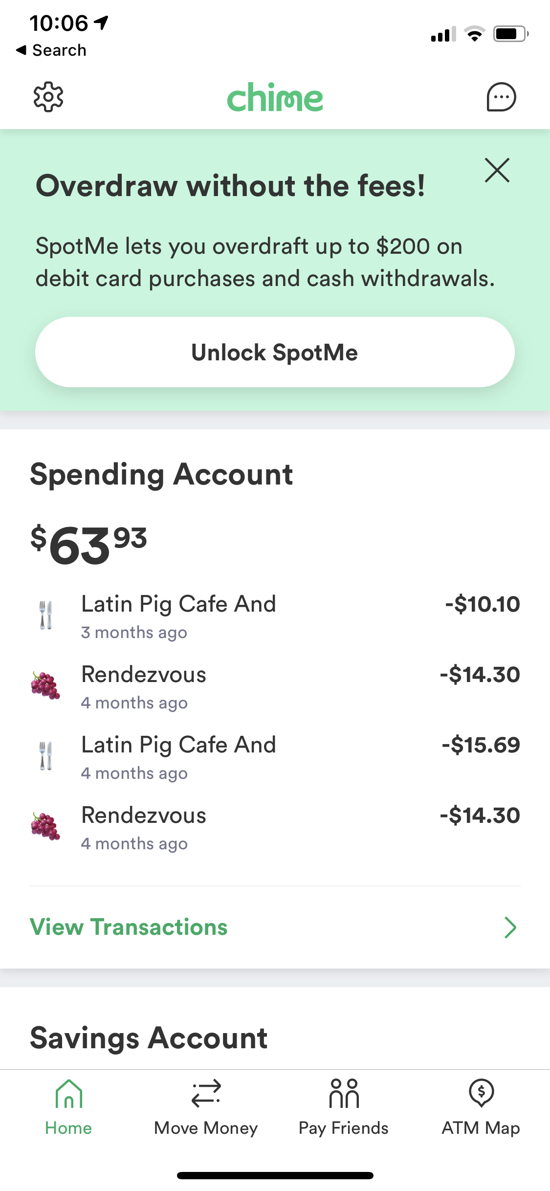
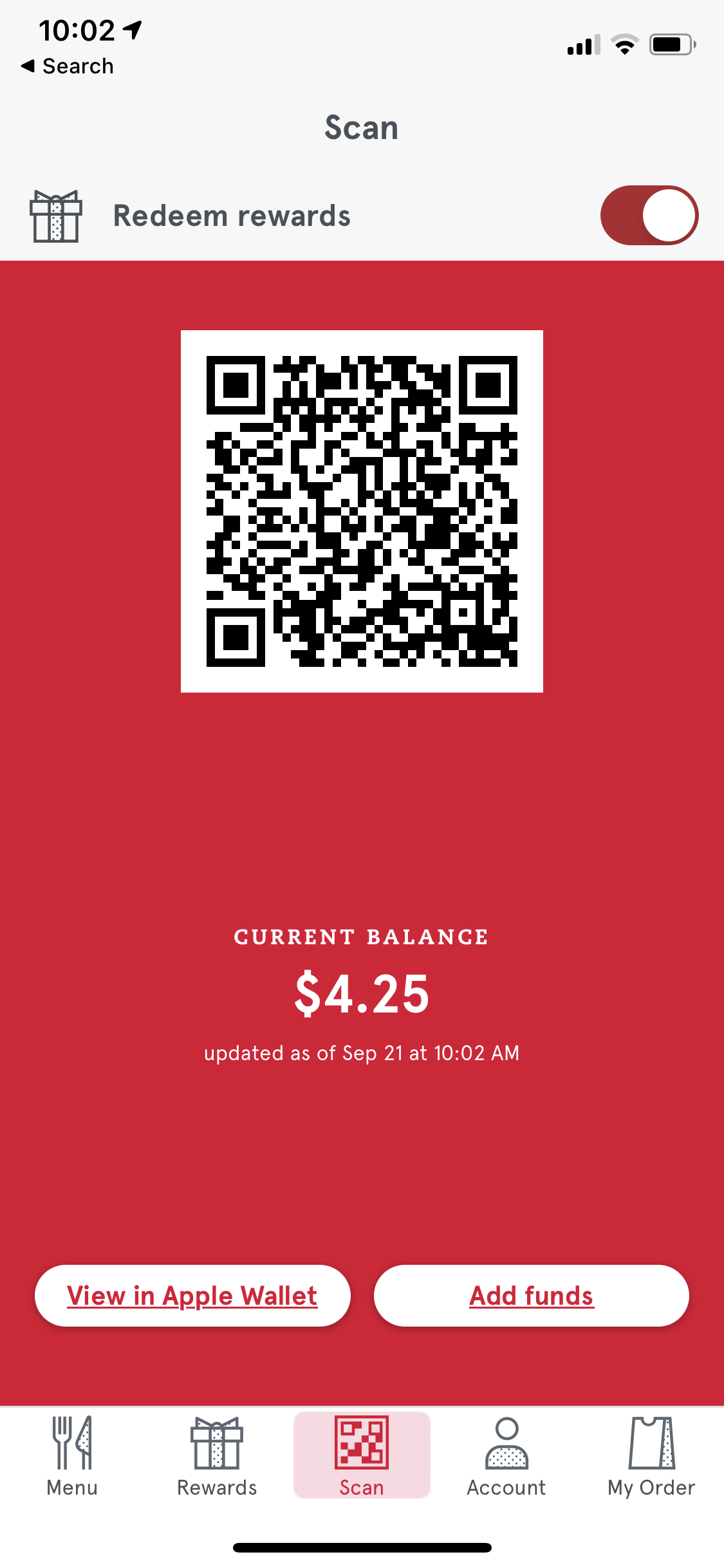
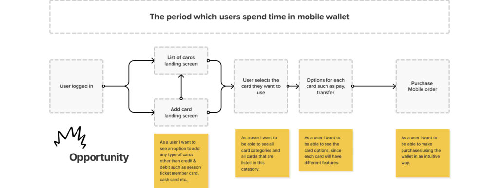
The competitive analysis session for our mobile wallet project was a crucial component of our research and strategy phase. During this session, we thoroughly examined and assessed the strengths and weaknesses of existing mobile wallet applications in the market. By evaluating the competition, we gained valuable insights into industry trends, best practices, and potential differentiators for our product. We analyzed user interfaces, features, security measures, and overall user experiences of various mobile wallets. This allowed us to identify areas where our project could excel and stand out, as well as areas where we needed to meet or exceed industry standards. Additionally, the competitive analysis session provided a solid foundation for making informed decisions about the direction and priorities of our mobile wallet’s design and functionality to ensure its competitiveness in a crowded market.
Wireframes

User Testing
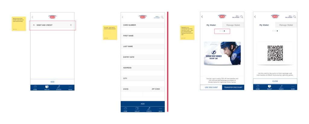
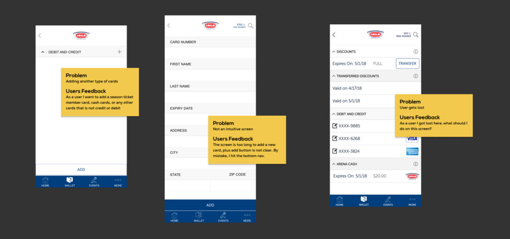
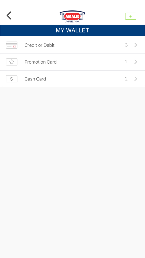
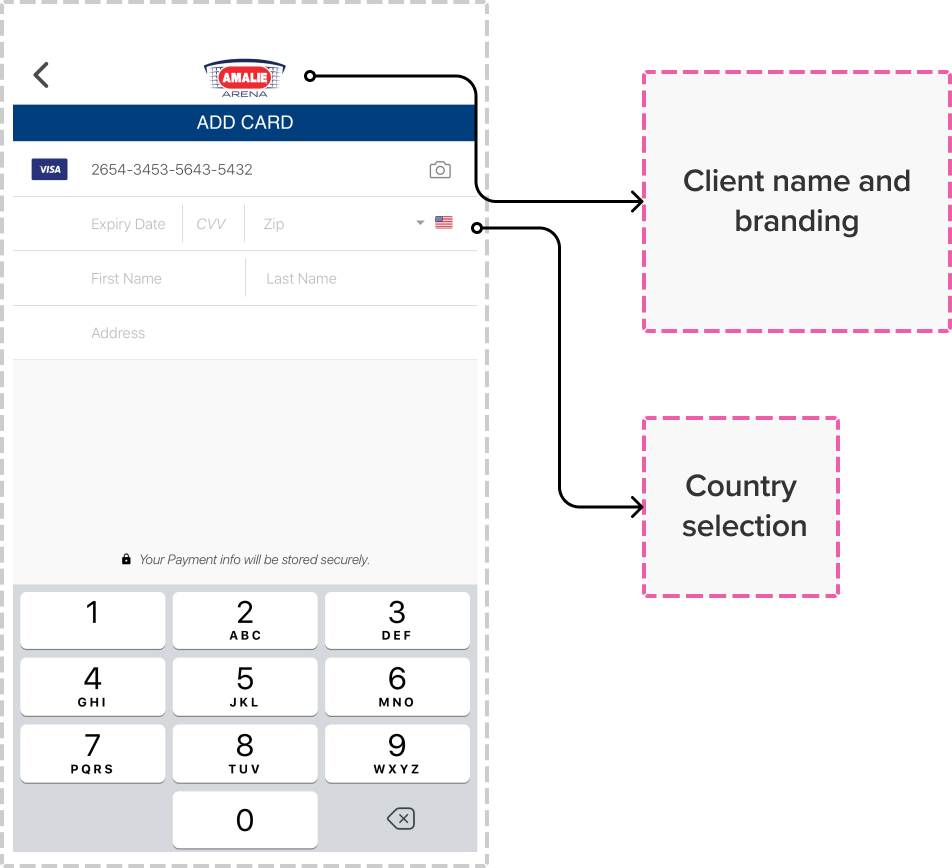
This testing session was scheduled to assess the ‘Add Card Functionality’ of the mobile wallet. The user was provided with a brief description of the fidelity and subject of the mockup and was instructed to follow their typical workflow. The user was also encouraged to provide feedback throughout the testing process.
Age : 41 | Job Title : Accountant | Location : LA, California | Cards in wallet : 4 | Season Pass : Yes
Wants:
- An intuitive method for adding cards.
- A method for adding cards other than debit and credit.
- A convenient way to make purchases using the wallet.
Observations:
The user became confused on the first screen where there are two buttons to add a card.
Wallet Setup
Prototypes
Playlist
UI Improvement
